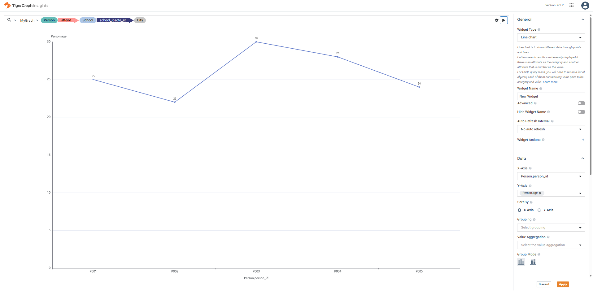
Line Chart Widget
The Line Chart Widget displays a standard line chart that shows a trend in data over time.
Inputs
Accepts data as vertices and edges for a pattern search result.
For a GSQL query result, accepts a list of objects that contain at least one numeric attribute to be used as the height of the point.
Widget window
Sorting and grouping
Customize the Category (X-Axis) and Value (Y-Axis) to set the horizontal and vertical axis data.
Sort the data by the category name (alphabetical left to right) or value (increasing left to right).
Use Grouping to select a column and create multiple lines based on the values in that column. Choose Stacked to layer the lines cumulatively, or Overlay to draw them independently on the same axes.
Use Value Aggregation to aggregate values using COUNT, AVG, SUM, MAX, or MIN.
Display options
You have several options to control the design of the X and Y axis labels of the graph, as well as turn on and off a key that explains each color present.
-
Toggle Show X-Axis Label and Show Y-Axis Label to show or hide axis labels.
-
Use X-Axis Label Rotation to adjust the angle of X-axis labels.
-
Toggle Show Label to show or hide data point values on the chart.
-
Use Direction to flip the chart orientation.
-
Toggle Show Legend to show or hide the chart legend.